Community Core
A web and mobile app managing the building permitting process
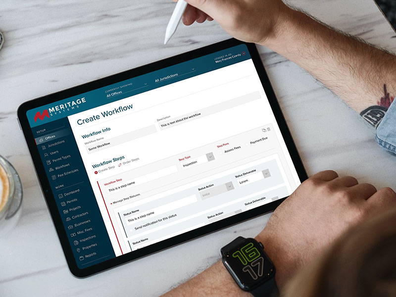
This client faced a familiar dilemma: an aging software application unable to keep up with the demands of its users. As part of the project’s leadership team, I worked closely with the client, development team leads and developers to redesign the web and mobile applications. The app needed to handle incredibly complex logic and large amounts of customization – no two permitting processes are identical – while also being intuitive enough that a user didn’t need hours of training to use it.
My Role
UX Researcher, UX Designer, UI Designer
Stakeholder Sessions
UX Audit
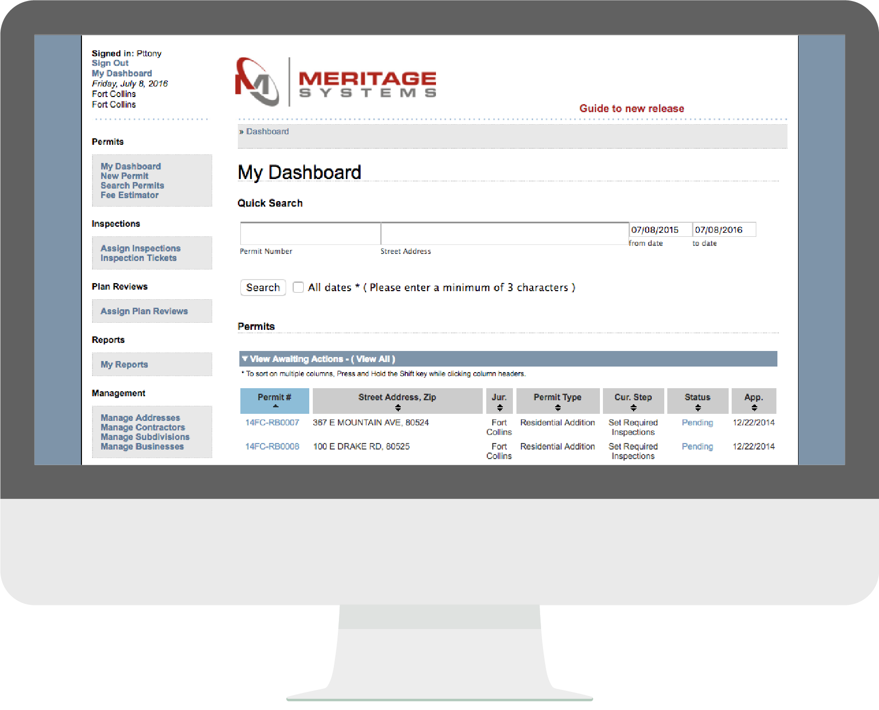
The goal for this phase was to audit the existing system, identify pain points, hear user feedback and issues with the existing app, and make general recommendations to solve those problems.
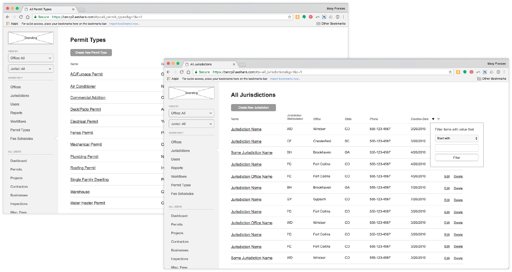
The first and most obvious problem was the site navigation. Users had difficulty getting where they needed to go, due to a confusing content hierarchy. A card sorting exercise helped sort content into a more intuitive structure and define a new site hierarchy.
The next challenge involved how to present huge amounts of complex information to users, as well as allow users to interact with that data in ways of their choosing. The solution may have seemed old-school in many consumer-facing apps, but in an enterprise world? Tables were the obvious winner.
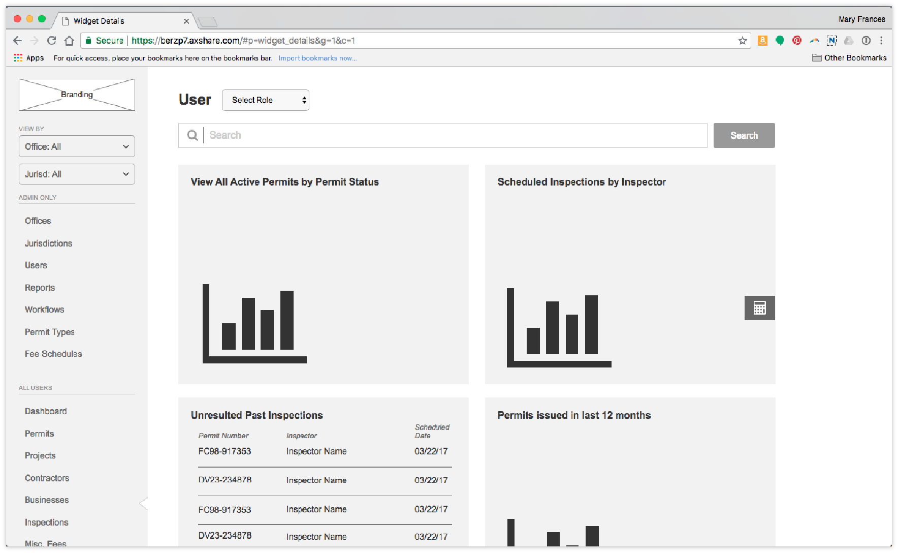
One of the remaining pain points was a lack of “home.” Upon logging in, the user was simply dropped into the workflow – a seemingly random place to “begin.” In order to solve the disorienting feeling users got the moment they entered the app, I introduced the concept of a dashboard. This anchors the user and provides relevant information based on what type of user they are. In addition to giving them a “home” to return to, this increased the likelihood of users accessing and interacting with the parts of the app most relevant to them. Happy users = return customers = continued revenue!
UI Design
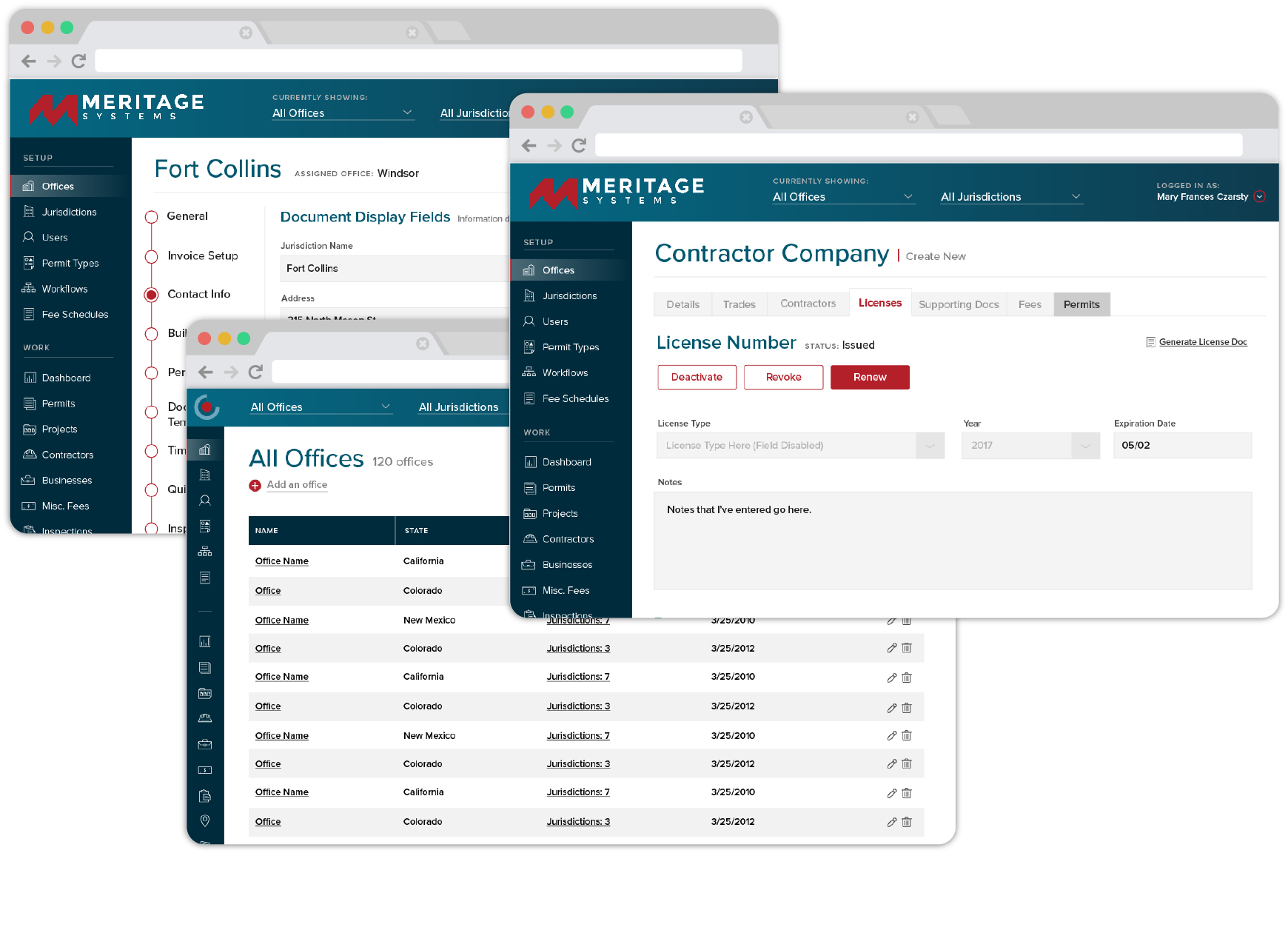
Users need to be able to quickly scan vast amount of information, so the choice of simple, clean typography was crucial to the design. Additionally, leaving room for the tables to “breathe” allowed users to more easily digest the information presented.
In addition to the clean, simple grid system, forms played another large part in the system’s UX. In order to make those large forms more digestible, I introduced secondary navigation to break up large amounts of information and give the user a sense of place.
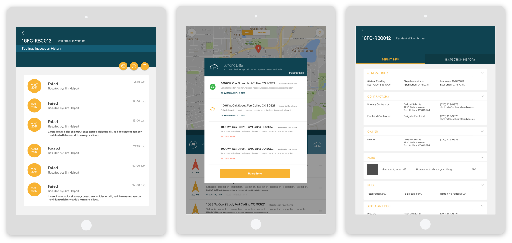
The mobile app targeted building inspectors in the field, and while it didn’t see a huge UX overhaul, the new design leveraged native iOS components and a simplified workflow to enhance the user experience. The app had to consider the user experience both online and offline, and inspectors responded positively to the graceful design and more informed experience.
Both the client and users responded overwhelmingly positively to the new architecture and UI. They cited ease of use and the cleaner, more intuitive design as helping them do their jobs more efficiently. A designer’s dream feedback!
