Tuya Tech
Peer to peer mobile and desktop delivery app
This system connects drivers and shippers to conduct same-day, express delivery. This start-up came to Exadel to create a product suite that includes web and mobile apps for shippers, a mobile app for drivers, and a web app for internal admins. For this particular project, I lead the initial user research and discovery phase.
My Role
UX Lead, UX Researcher, UX Designer

Stakeholder Sessions and Usability Audit
The client had a previous version of the product that while in use, left lots to be desired in terms of functionality and general user experience. I spent time combing through the initial release to evaluate the UX, and met with the client to hear what they thought the problems were in their own words.
It did not take much interaction with the app to discover a few key problems. The existing shipper web app was basically a giant, confusing form with a bunch of accordions that left the user with no sense of their place in the order process. Form fields were shown and hidden seemingly at random, which made sense once I understood the business requirements – but no app should require that level of education in order to use it.
The client was primarily concerned with the visuals – they wanted something that looked a little more modern, was responsive and felt more approachable than the existing version. Of course, top of their goal list was to fix those things to encourage shippers to adopt the app and keep coming back – with return orders equaling return revenue.
User Interviews
No UX audit is complete without talking to the people who actually use the system, so the next step was to interview existing drivers and shippers. I created scripts for interviews with drivers and shippers and gathered their thoughts.

Recommendations
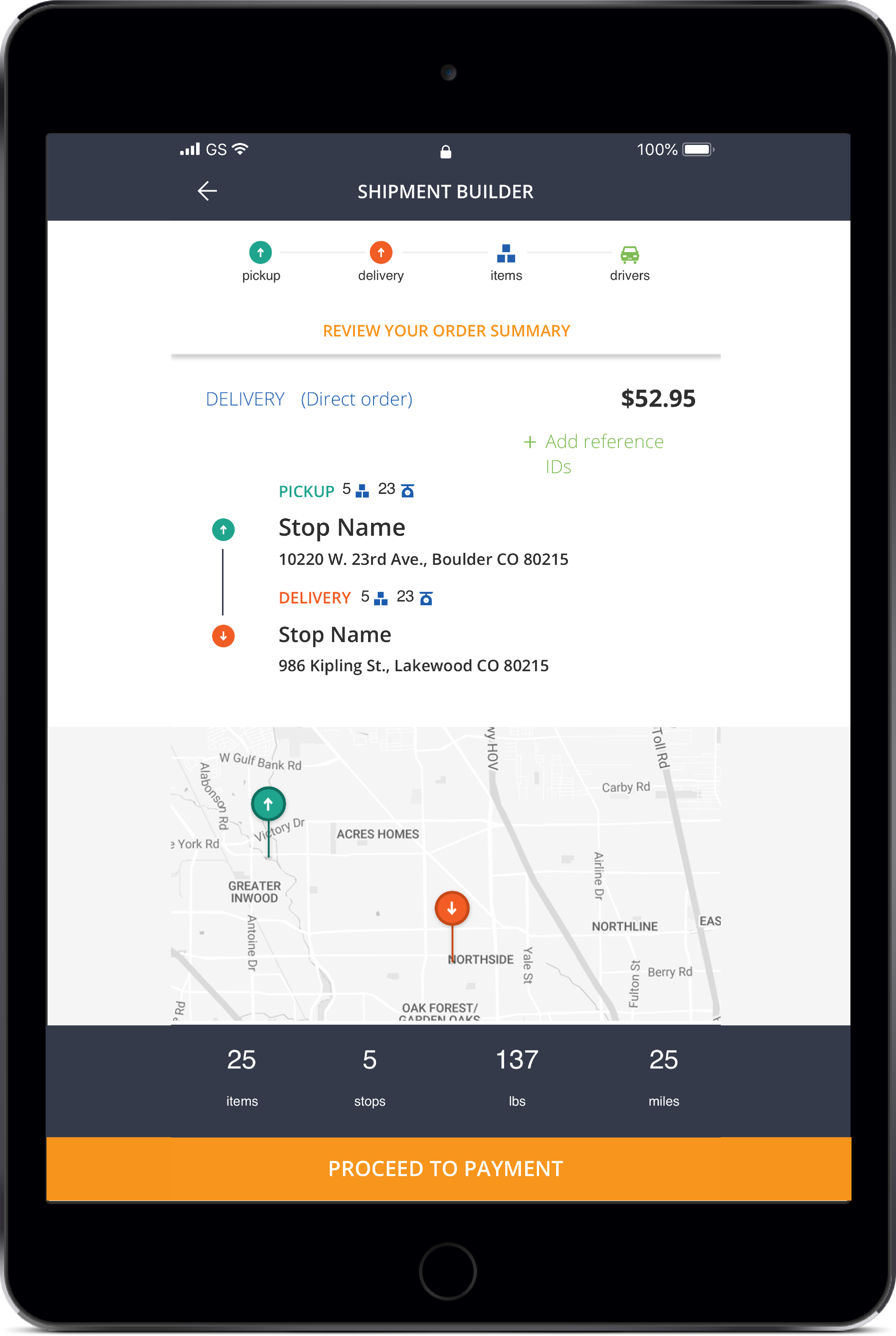
Based on user feedback, stakeholder input and a deep dive into the client’s initial requirements, I created a set of wireframes and design patterns for the desktop shipper app that would ultimately drive the UX/UI of the entire product suite.
The first thing I did was break the action up into intuitive, digestible chunks. I gave the user a greater sense of place in the order process by introducing the combo panel-and-map view. It made it easy for users to see a summary of their entire order as well as quickly drill down into each individual stop. The app allows for a huge amount of customization for each order, so a flexible and intuitive UI was a must.
At this point, I passed off all of the UX recommendations to the product design time to flesh out the rest of the product by using a lean/agile and design sprint process.
